BuilderBots, built to be seen.
See how we gave a team of autonomous construction robots an identity as strong as the machines themselves, from the logo to the polo shirt to the side of the trailer.
Overview
BuilderBots: A Brand Identity for the Next Generation of the Jobsite
Diligent Marketing Solutions is a growth partner for small and mid-sized businesses, delivering strategy, design and development through one flexible, points-based subscription. For BuilderBots we handled everything a young hardware company needs to look credible on day one.
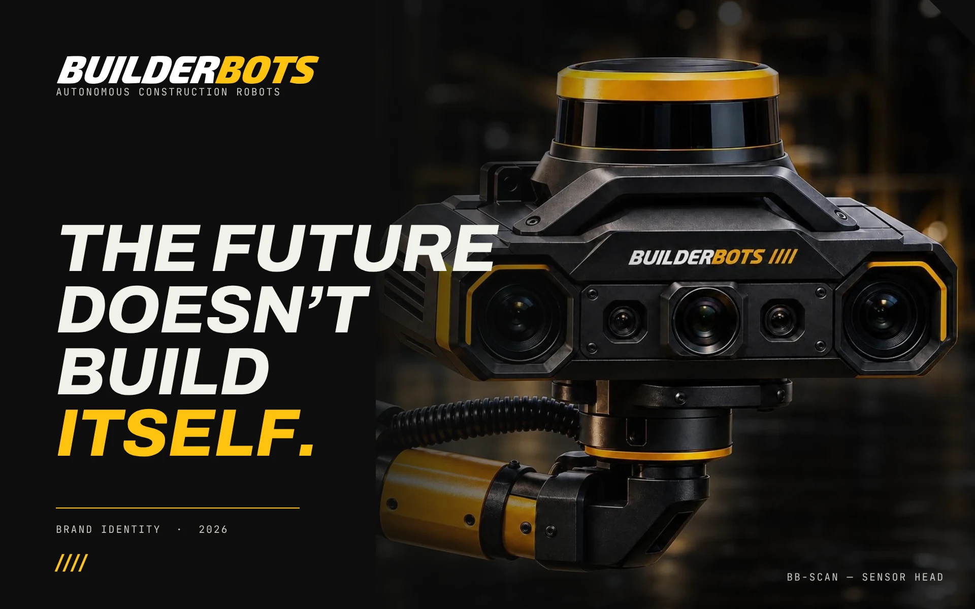
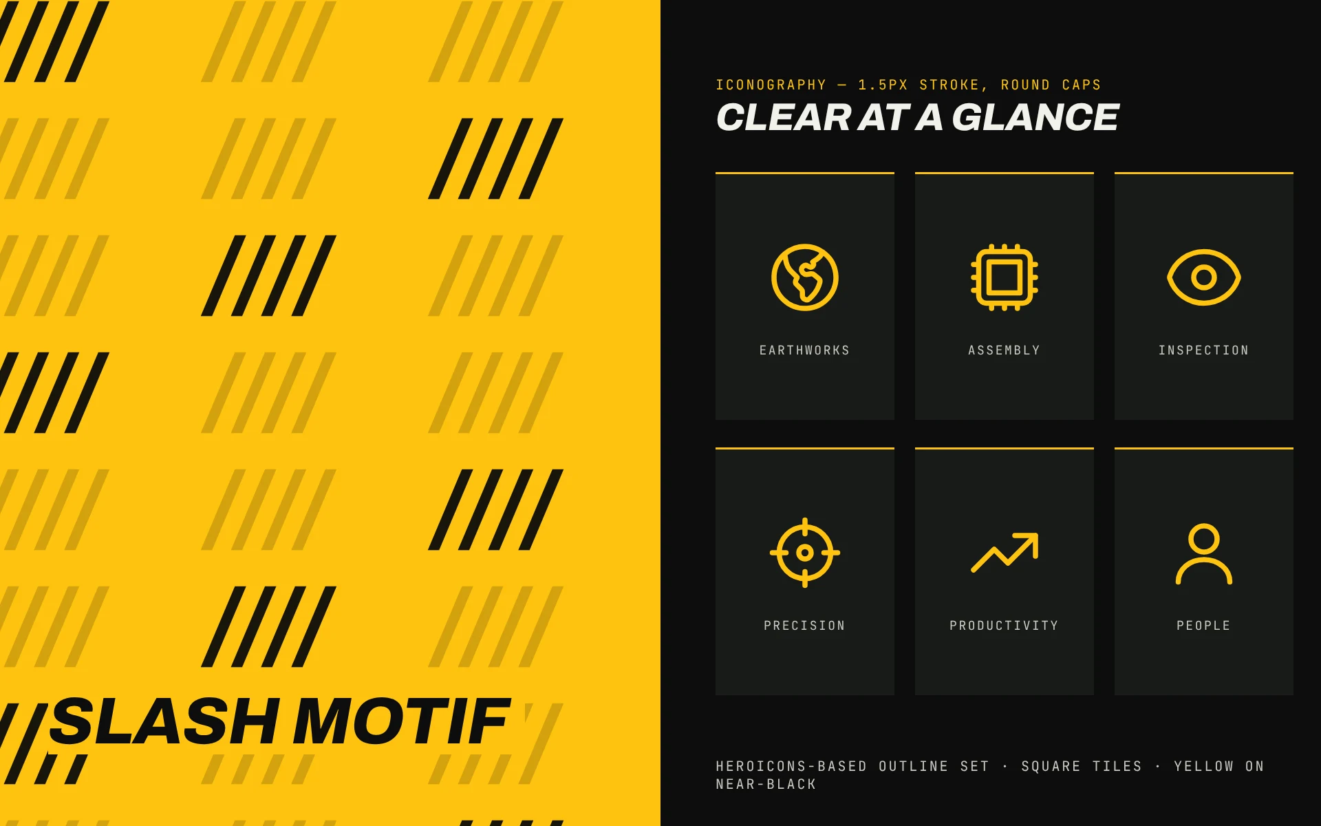
BuilderBots makes autonomous robots for construction: BB-DIG for earthworks, BB-LIFT for assembly and BB-SCAN for inspection. The company needed a brand that felt serious, strong and safe, with no cartoon robots and no sci-fi fluff, but still approachable for the crews who work beside the machines.
The Challenge
The Challenge: A Brand That Looks as Tough as the Machines
Construction is a high-trust, high-risk industry. Owners, developers and equipment partners evaluate every supplier on reliability first. The brand had to read as heavy-duty and engineered, work at 30mm on a business card and at 53 feet on a trailer, and survive in photographs, on hi-vis workwear and in the dust of a real site.
- 01 Logo & lockups
- 02 Colour & typography
- 03 Iconography & slash motif
- 04 Uniforms & workwear
- 05 Business cards & stationery
- 06 Fleet livery
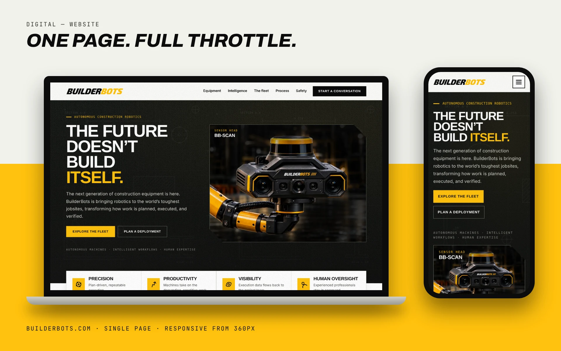
- 07 Single-page website
- 08 Brand kit & slide template
Our Approach
Our Approach: Safety Yellow, Slanted Letters, Zero Fluff
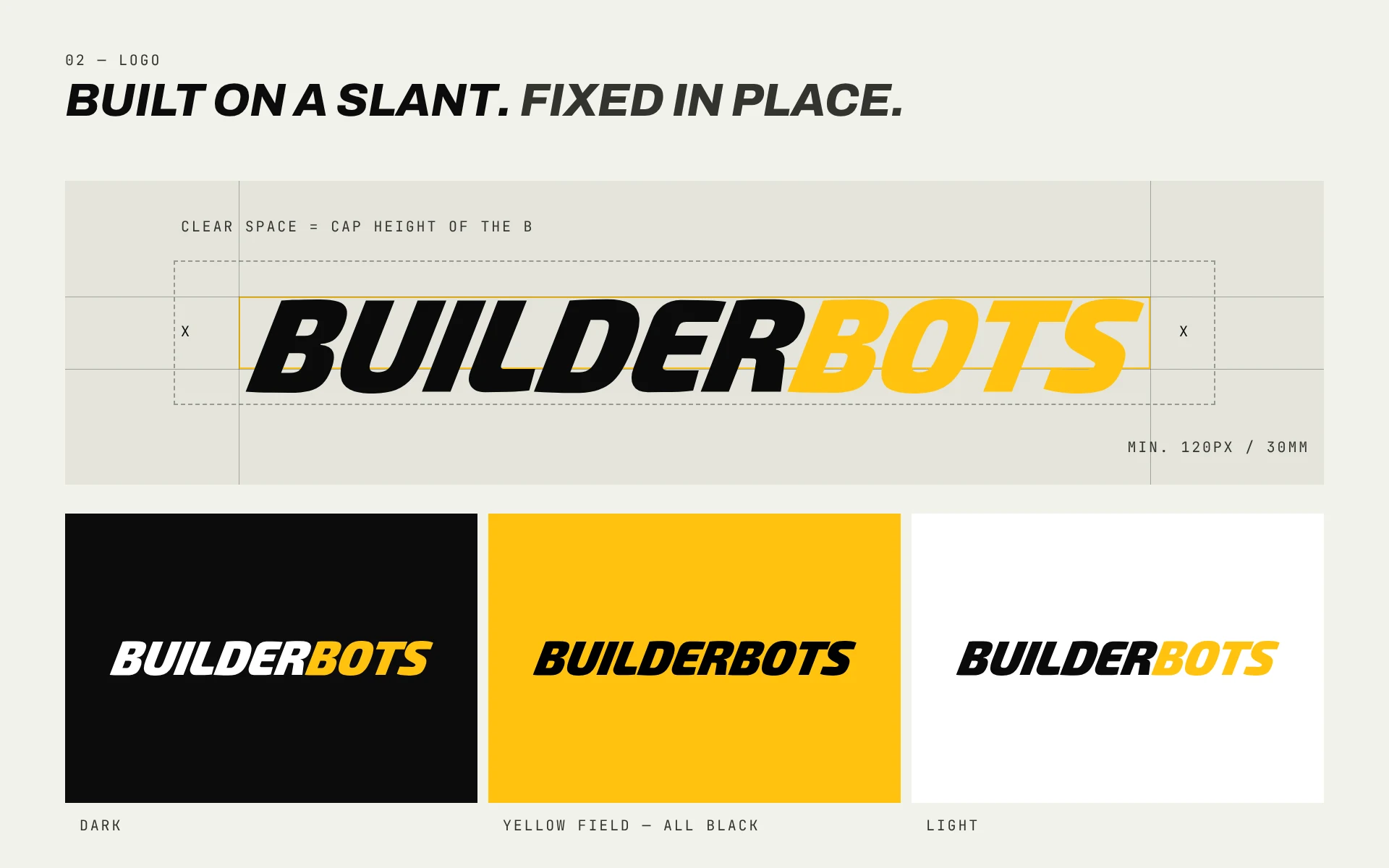
The logo is a fixed, italic wordmark that leans forward the way a crew does when work is moving. BUILDER stays white or black, BOTS stays safety yellow, and neither ever animates. A repeating slash motif borrowed from hazard striping gives the brand its pattern, from chamfered frames on the website to the reflective band on the trailer.
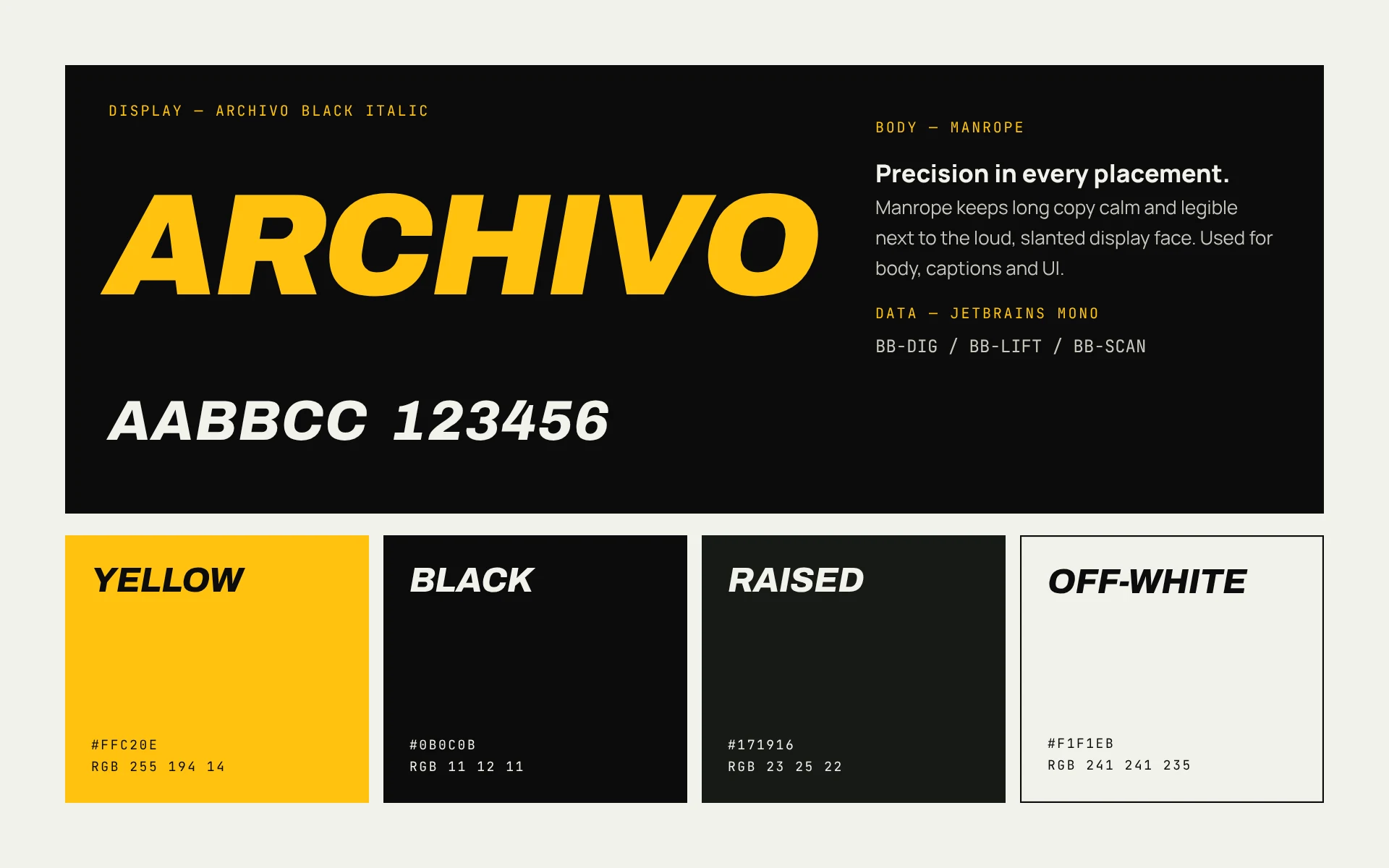
The system is deliberately small: three typefaces, four colours, square corners and a single icon style. That keeps every new piece, from a safety poster to a slide, instantly recognisable.
- #FFC20E
- #0B0C0B
- #171916
- #F1F1EB
On the Body: Uniforms and Workwear
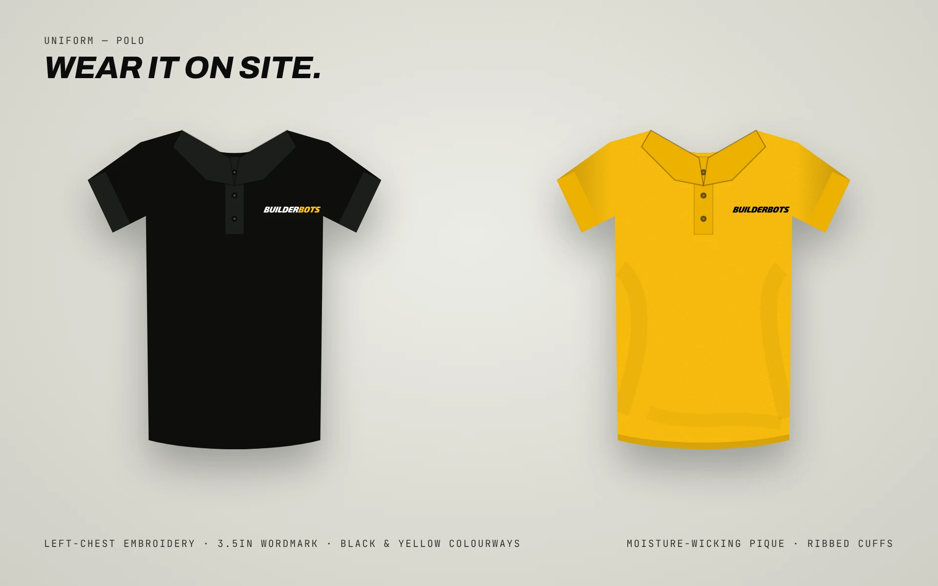
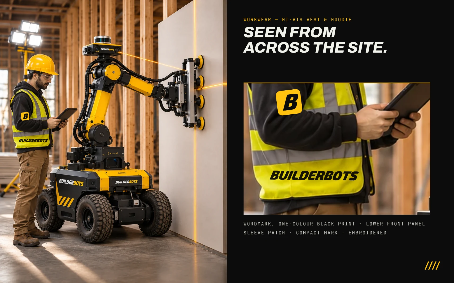
Brand identity lives or dies on the jobsite. We designed an embroidered polo in black and yellow for office and field leads, and a one-colour print for hi-vis vests with a compact patch for hoodies, so crews are identifiable from across the slab without breaking safety-colour standards.
On the Desk and on the Road
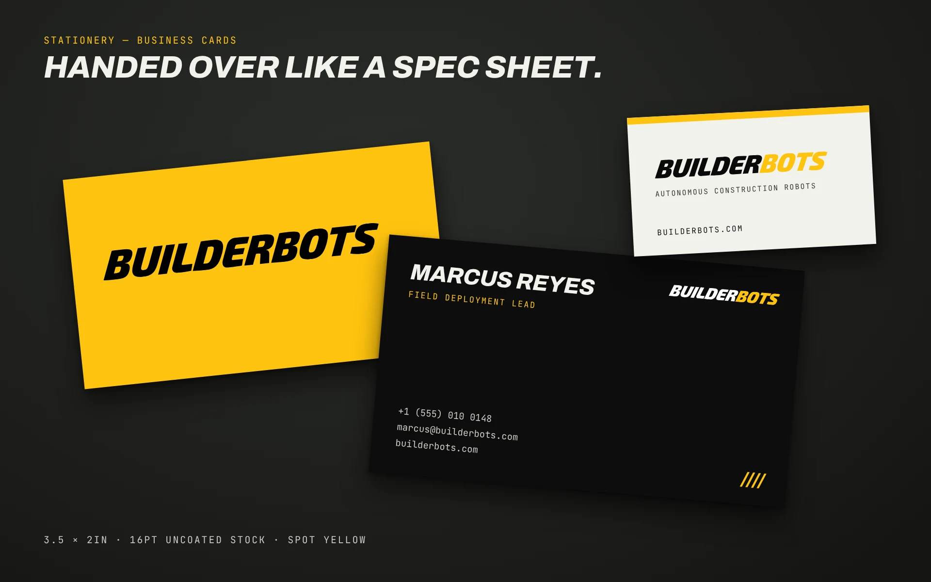
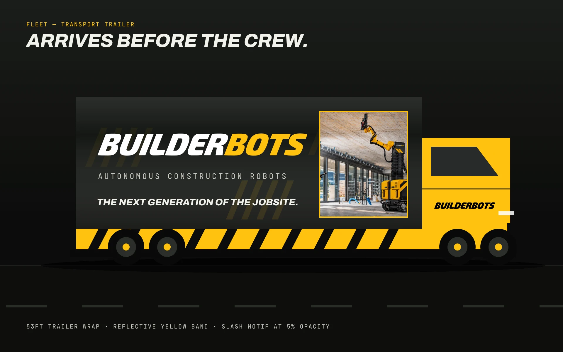
Business cards use a hard yellow front and a spec-sheet back, so the first handshake feels like receiving an engineering drawing. At the other end of the scale, a 53-foot trailer wrap carries the wordmark, the master line and a photo of the fleet, and it arrives before the crew does.
The Results
The Results: A Brand Ready for the Field
BuilderBots launched with a complete identity kit: logo files, colour and type specs, a hosted brand-guide page, a 12-slide presentation template, apparel and print layouts and a fast single-page website with an animated blueprint-style loader and responsive layouts from 360px up. Everything shares one visual language, so every new asset feels like it belongs with the last.
Why This Matters for You
Hardware, SaaS or services, the lesson is the same: a brand is a system, not a logo. When the colours, type, photography and merchandise all follow one set of rules, a small team can look like an industry leader, and every dollar spent on marketing compounds.
Want that for your business? Book a free 30-minute Efficiency Call and we will show you where a points-based design and growth partner could save you time and money.
Ready to Scale Your Marketing ROI?
Tell us where you are stuck and we will map the fastest route to a brand and a website that win more work.